FEA3可视化19柱线图插件说明文档
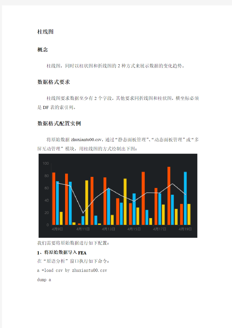

柱线图
概念
柱线图,同时以柱状图和折线图的2种方式来展示数据的变化趋势。
数据格式要求
柱线图要求数据至少有2个字段,其他要求同折线图和柱状图,横坐标必须是DF表的索引列。
数据格式配置实例
将原始数据zhuxiantu00.csv,通过“静态面板管理”、“动态面板管理”或“多屏互动管理”模块,用柱线图的方式绘制出下图:
我们需要将原始数据进行如下配置:
1、将原始数据导入FEA
在“原语分析”窗口执行如下命令:
a =load csv by zhuxiantu00.csv
dump a
2、转换格式
a = @udf a by udf0.df_set_index with (日期)
dump a
3、执行如下语句,将a表中的数据存储到ssdb数据库,并定义KEY为zhuxiantu:store a to ssdb by ssdb0 with zhuxiantu
在静态面板、动态面板或多屏互动中,输入此处的KEY“zhuxiantu”,选择类型为“柱线图”,就可绘制出柱线图。
英语写作 饼状图
5/22/2012 Ab2 Wate The Meal Sold in a Supermarket This is a pie chart that shows the proportion of the meal sold in a supermarket.The total meat sold in the supermarket is classified into six types as follows: chicken, pork, beef, lamb, fish and others. Overall, chicken has the largest proportion, which accounts for 40%, while others has the smallest percentage, at 2%. As can be seen in the pie chart, chicken, which makes up 40%, is the most popular among the total meat sold, then next is pork with 20%, followed by beef, constituting 18%; and finally come lamb, fish and others at 15%, 5% and 2% respectively, It should be noted that the sale of pork is half as much as that of chicken. And it is also interesting to note that the sale of chicken is 20 times as much as that of others. It can be concluded from the pie chart that chicken is most commonly bought meat while others is the least commonly bought meat.
雅思作文写作Task-1第二课时—柱状图和饼状图
图表作文讲解2:柱状图和饼状图
分析思路: 1.第一幅柱状图的描述单位是百万,即人数;第二幅则是百分比。 2.第二幅柱状图仅显示了1970年和2000年的信息,而第一幅柱状图显示了1970、1980、 1990、2000年的信息。 3.由第一幅柱状图可以看出,从1980年到2000年,结婚人数和离婚人数的变化趋势相似。 4.从第二幅图可以看出,在2000年,结婚和寡居的成年人的比例有所降低而从未结婚过 和离婚的比例则有所上升。 文分析 One chart①shows the number of marriages and divorces in the USA in 1970, 1980, 1990 and 2000.The other②shows the marital status of adult Americans in 1970 and 2000. 首段概述图表信息,对题目进行改写,注意动词的用法和时态。 ?描述类的常用词有:show/describe/illustrate/demonstrate/indicate;
分析思路 1.四个饼状图可以分为两组,一组是澳大利亚,一组是法国; 2.饼状图由五部分组成:coal, oil, natural gas, hydro power, nuclear power; 3.图中的时间是1980年和2000年 4.单位是units 文分析 The charts①compare the sources of electricity in Australia and France in the years 1980 and 2000. Between these years electricity production almost②doubled, ③rising from 100 units to 170 in Australia, and from 90 to 180 units in France. ①对比:compare ②翻番:double ③从多少增长到多少:rise from……to…… In 1980 Australia used coal as the main electricity source (50 units) and the①remainder was produced from natural gas, hydro power (each producing 20 units) and oil (which produced only 10 units). By 2000, coal had become the fuel for more than 75% of electricity produced and only hydro②continued to be another significant
英语写作—饼状图
5/22/2012 Ab2 Wate 2011301360115 The Meal Sold in a Supermarket This is a pie chart that shows the proportion of the meal sold in a supermarket.The total meat sold in the supermarket is classified into six types as follows: chicken, pork, beef, lamb, fish and others. Overall, chicken has the largest proportion, which accounts for 40%, while others has the smallest percentage, at 2%. As can be seen in the pie chart, chicken, which makes up 40%, is the most popular among the total meat sold, then next is pork with 20%, followed by beef, constituting 18%; and finally come lamb, fish and others at 15%, 5% and 2% respectively, It should be noted that the sale of pork is half as much as that of chicken. And it is also interesting to note that the sale of chicken is 20 times as much as that of others. It can be concluded from the pie chart that chicken is most commonly bought meat while others is the least commonly bought meat.
雅思写作Task1饼状图考官范文(3)
雅思写作Task1饼状图考官范文(3) 本文为大家收集整理了雅思写作Task1饼状图考官范文(3)。认真研读一定的雅思范文及作文模板可以帮助我们检验自己的写作水平,并能很好地吸收和应用优秀范文里的优秀内容。 The charts below show the percentage of food budget the average family spent on restaurant meals in different years. The graph shows the number of meals eaten in fast food restaurants and sit-down restaurants. Write a report for a university lecturer describing the information in the graph below.
Sample Answer: The given illustration compares the amounts spent on restaurant foods and on home cooking foods in four different years and gives data on the number of meals eaten in two different restaurant types. As is presented in the pie chart, initially in 1970, 90% of total food budget was spent on home-made foods while only 10% was spent on restaurant foods. The amount spent on restaurant meals increased to 15% in 1980 while it reached to 35% in 1990. Finally in 200 average family spent half of the total budget in restaurant meals and that shows a rapid increase on the people’s habit of having meals in restaurants. In the line graph, we can observe that in 1970, the fast foods and sit-down restaurant meals were taken 20 thousand times each and over time these numbers kept increasing. Finally in 2000, more than 90 thousands fast food meals were eaten while the sit-down restaurant meals were eaten 50 thousand times a year. This indicates the changes of
图表作文写作常识
图表作文写作常识 1, 图形种类及概述法:泛指一份数据图表:a data graph/ chart/ diagram/ illustration/ table 饼图:pie chart 直方图或柱形图:bar chart / histogram 趋势曲线图:line chart / curve diagram 表格图:table 流程图或过程图:flow chart / sequence diagram 程序图:processing/procedures diagram 2,常用的描述用法 The table/chart diagram/graph shows ( that) According to the table/chart diagram/graph As ( is) shown in the table/chart diagram/graph As can be seen from the table/ chart/ diagram/ graph/ figures , … Figures/statistics shows (that)… It can be seen from the figures/statistics We can see from the figures/statistics It is clear from the figures/statistics It is apparent from the figures/ statistics/table / chart/ diagram/ graph figures ( that) The table/ chart/ diagram/ graph shows/ describes/ illustrates how... 3,图表中的数据( Data )具体表达法 数据(Data)在某一个时间段固定不变:fixed in time 在一系列的时间段中转变:changes over time 持续变化的data 在不同情况下: 增加:increase / raise / rise / go up ... 减少:decrease / grow down / drop / fall ... 波动:fluctuate / rebound / undulate / wave ... 稳定:remain stable / stabilize / level off ... 最常用的两种表达法: 动词+副词形式( Verb + Adverb form ) 形容词+名词形式( Adjective + Noun form ) 二,相关常用词组 1,主章开头 图表类型:table, chart, diagram graph, column chart, pie graph 描述:show, describe, illustrate, can be seen from, clear, apparent, reveal, represent 内容:figure, statistic, number, percentage, proportion 2,表示数据变化的单词或者词组 rapid/rapidly 迅速的,飞快的,险峻的dramatic/dramatically 戏剧性的,生动的 significant/significantly 有意义的,重大的,重要的sharp/sharply 锐利的,明显的,急剧的steep/steeply 急剧升降的 steady/steadily 稳固的,坚定不移的gradual/gradually 渐进的,逐渐的 slow/slowly 缓慢的,不活跃的slight/slightly 轻微的,略微地stable/stably 稳定的3,其它在描述中的常用到的词significant changes 图中一些较大变化noticeable trend 明显趋势during the same period 在同一时期grow/grew 增长distribute 分布,区别unequally 不相等地in the case of adv. 在...的情况下in terms of / in respect of / regarding 在...方面 in contrast 相反,大不相同government policy 政府政策market forces 市场规率 measure n.尺寸,方法,措施v.估量,调节
雅思作文写作Task1第二课时—柱状图和饼状图
雅思作文写作Task1第二课时—柱状图和饼状图
图表作文讲解2:柱状图和饼状图学生面授老师 时间本次课时雅思写作第二课 时 教学思路1.作文简介、写作技巧 2.实例讲解 3.分析总结 4.课后作业 教学目标柱状图、饼状图知识点讲解基本特征和写作方法 实例分析 讲解重点写作技巧讲解 范文学习 柱状图和饼状图写作方法 备考资料剑桥IELTS4-8
教学详细内容: 一、写作技巧详解 1.柱状图特点 ?柱状图是动态图表,切入点是描述趋势。 ?柱状图写作注重“比较”(找出similarity)和“对比”(找出difference),也就是说需要横向总结所有柱状图表的共性特征,也要分别描写各个柱子的个性特征。 ?两种写作方式:其一是对不同时间段内的数据进行比较,适合于数据代表的物体较少且时间界限明确的情况。另外是对单独数据的全程描述,适合于描述数据对象很多且时间划定不清晰的情况。 2.饼状图特点 饼形图与柱形图或者线形图所截然不同的是它没有了横轴与纵轴,而以饼形的分割来表示百分比,能够依照三步审题分析法来进行观察: ?观察共有几张饼状图,以及它们之间的关系是什么(一般说来,雅思图表题中极少见到单饼图); ?观察每张饼状图中有哪几个区域,以及各个区
域分别代表什么; ?观察单个饼状图中各区域间的百分比差异,以及相同区域在各个饼状图间的百分比的比较或发展。 饼状图是所有图表题中最好写的一种,唯一值得注意的地方在于如何丰富百分比的表示和“占”的表示,要采取多样性的表示,如25%=a quarter of, 50%=half of, >50%=a/the majority of.描写饼状图中的比例构成就是饼状图图表作文的重点,但也应注意,这种描述并不是对图形的简单重复,对各项数据比例的描述应建立在归纳整理的基础上有条理地进行。学生不但要善于找数据,更重要的是要善于从数据或比例中升华出来,找到规律和本质。 常见词汇、句型及模板 1.柱状图 1)倍数的表示 今年的产量是去年产量的两倍 ?The output this year is two times(twice) more than last year’s. ?As much as 不可数名词 as many as 可数
(完整版)雅思小作文:饼图写法全解析
雅思小作文:饼图写法全解析 朗阁雅思考试研究中心 在雅思的学术类小作文中我们经常会遇到饼状图写作,不要看着一张一张的图,就退缩了,但是相对来说,这个题型还是比较容易写的一种图形,不过学生们也一定不要当做这是一件简单的事情,想要拿高分还是需要努力的,千万不能掉以轻心,否则不要就是因为这部分得分的不达标而影响到最后的综合得分。那么下面的文章中,朗阁雅思考试研究中心写作组的专家将要探讨的是饼图中静态数据和动态数据写法中的一些区别,并且将会从高分的角度来对各种写法作一汇总,希望对大家考试的准备有一定的帮助。 首先我们必须搞清楚什么是静态什么是动态数据的饼图: 当我们在考试中看到这个图示上的数据都是固定的,没有发生任何变化的时候,那么就能够认定这属于静态数据,搞清楚之后我们就能够开始写作了。 图二:
不要以为这里有很多的数据就属于动态的,其实这个图示还是表示是静态的,因为我们看到在途中的各项比重相对来说也是比较稳定的,因此这个饼图的数据也是属于静态的,那么究竟哪种数据属于动态的呢? 图三:
这个就是动态的图示,为什么这么说呢,因为两张图种的占比数据上出现了很大的差异,这是两个年份的数据,但是各自的所占比重有所不同,所以是动态的数据。 由此,我们可以得出结论,如果我们看到的是一张饼图,而且描述的是一段时间之内比较稳定的数据,那么我们就能基本上断定那就是静态的数据,但是我们如果看到的时候两张饼图,在两个时间段时间的对比,数据出现了明显的变化,那么就能够基本上断定这张图表示的就是动态的题型。
一、静态数据饼图的主体段写作理论 朗阁雅思考试研究中心建议考生可先按照扇形面积大小从大到小排列数据,若遇到饼图中有总数的描述,宜在开头先写。主体段在描写各个扇形数据的时候,要注意详略,即最大和第二大的扇形要重点描述。下面我们先以图一作为例子来详细解读这种写作套路: 首先,我们可以看到,在图中央有一个总数,因此我们先在开头段将其预先作交代:Overall, Coca-cola sold a total of 17.1 billion cases of their fizzy drink product worldwide in the year 2000. 或者我们还可以这样写: Overall, a total of 17.1 billion cases of Coca-cola fizzy drink were sold worldwide in the year 2000. 接着,我们就可以直接来写主体段了: The largest consumer was North America, where 30.4 percent of the total volume was purchased. The second biggest consume r was Latin America, taking up slightly over a quarter. Europe and Asia purchased 20.5 and 16.4 percent of the total volume respectively while Africa and the Middle East remained fairly small consumers at 7 percent of the total volume of sales. 以下我们来解读一下这种写法:图中一共有5块扇形区域,最大和第二大的扇形区域我们分别使用主系表的简单句引导数据的含义,请大家注意划线的部分。其中,两个句子的主语和表语其实都是可以互换的,这个可以让句子成分再多变些,另外,两个句子后面接续的数据描写的句型我们也要做到不同,比如第1个句子后面我们用的是定语从句,而第2个句子后面我们就用分词结构来描写了。接下来第3大的数据由于处于中间的位置,既非最大也非最小,不是很重要,因此就直接用简单句描写了。最小的那块扇形面积可以和前面的连起来组合成一个并列句,也可以单独写,若是单独写的话还可以用主系表的简单句引导,但是表语一般用insignificant,如:The figure for Africa and Middle East was insig nificant,…后面再接续数据即可。 在描写最大的两块扇形面积区域的时候,我们也是用相似的句式,即主系表来描述,然后接续定语从句或者介宾短语来说明数据。饼图中所占份额相对较小的我们就采用略写的方式交
2015最新的雅思作文模板(饼状图)
三一文库(https://www.wendangku.net/doc/df9992861.html,) 〔2015最新的雅思作文模板(饼状图)〕▲雅思小作文模板--饼状图 ▲ 1.描述 It is clear that the most (adj.) xx is A, which accounts for m% of all x . B is the next largest(adj.)xx ,n% lower than A of all x and followed closely by C . The above three items of xx take uo about o% of the x% By contrast D E andF make uo the smallest percentage of total x , which are p% q% and r% ,respectively.
The regions can be divided into two groups-one where … and the other where the reverse is the case. ▲ 2.比较,占据,百分数 Form, comprise, make up, occupy In 1950, the urban population represented less than 13% of the total. It is now about 40% and is expected to reach 60% by 2030. (摘自BBC) ▲ 3.比例,倍数 A quarter of… Half of…
雅思小作文饼图写作结构解析
雅思小作文饼图写作结构解析 雅思小作文饼图写作结构一文总结了出现在雅思学术类考试的小作文中,4种不同的饼图的处理方式和写作思路。今天给大家带来了雅思小作文饼图写作结构,希望能够帮助到大家,一起来学习吧。 雅思小作文饼图写作结构 许多考生觉得饼图十分简单,也就是一些百分比及数字的列举,对该类图表不太重视,准备并不充分。笔者根据学生的日常作业来看,很多学生并没能准确把握这一图表的特征。在实际考试中,真题大多是多个饼图结合出现,如果一味地罗列数据照搬词组,不但*读起来枯燥无味,句式和词汇也缺少变化,是无法得到理想的分数的。*中,写作组的专家将对饼图的分析方法、词汇句型和写作套路进行总结和分类,以帮助考生理清写作思路,更准确地回应题目的要求。 1. 分析思路 在实际考试中,一般以三到四个饼图出现为主,最多曾出现过六个饼图的组合,但无论如何变化,多饼图一般可分为以下两种模式,笔者将举出一些实例进行分析: 1)无关型饼图
三个饼图它们分别介绍了世界上的不同花费比例,世界人口分布及资源消耗的去向,三个饼图涉及的内容和划分标准不尽相同,不可能将三者结合起来一起论述。 对于这种图表,我们的*框架架构如下: Introduction:分别概述三个饼图所说明的信息 如:The three pie charts respectively illustrate some data regarding the distribution in world spending, global population and consumption of resources. Body:分别说明各饼图的内容,辅以数据(段落层次按照个数划分即可,本题就可以分成三个段落)分别进行排序,稍后详细分析。 Conclusion(选用):说明三个饼图的相关含义,如无,可提炼一下每个饼图最典型的特征(如果已达到要求字数且充分说明内容,结尾段可以略去) 详细来看,世界花费主要支出在食物方面,交通、房产和穿着次之,其他项目合计占到总数的40%;亚洲是世界人口的主要****地,欧洲、美洲和非洲均占到10%以上,其他地区人口较少。这两个饼图都可以用“排序”的方式来列举数据,具体的写法我们会在下面详细说明。最后一个图表可以用比较的办法突出美国欧洲等发达地区耗费了世界上五分之二的资源。
雅思小作文饼状图写作范例、思路、常用句式
雅思小作文:饼状图一例 Many women want or need to continue working after they have children. The chart below shows the working after they have children. The chart below shows the working pattern of mothers with young children. 作文写作要点: 介绍各扇面及总体的关系。 各个扇面之间的比较,同类扇面在不同时间、不同地点的比较。 重点突出特点最明显的扇面:最大的、最小的、互相成倍的。 The basic trends of the four charts: Just after bearing children, back to work. The older child…the more… Most part-time during child 5~9 Child 10+, full time double, part-time less the introduction can be written like this: Even just after having a child, a large number women return to work. As the child grows older, the percentage of mothers who choose or need to continue working rises. At least until the child is ten, the larger number of working mothers take part-time occupations. When the child is ten years or older, the number of the full-timers more than doubles while that of the part-timers decrease. Each chart entails / contains instruction, which illustrates what the chart involves rather than the over trends. Writing Paragraphs: Information analyzed according to the pie charts. Child 0~2, 30% back to work (19p.t., 11f.t.)
雅思写作Task1饼状图考官范文(2)
雅思写作Task1饼状图考官范文(2) 本文为大家收集整理了雅思写作Task1饼状图考官范文(2)。认真研读一定的雅思范文及作文模板可以帮助我们检验自己的写作水平,并能很好地吸收和应用优秀范文里的优秀内容。 The pie chart below shows information on the highest level of education of women in someland in 1945 and 1995. Write a report for a university lecturer describing the information in the two graphs below.
Sample Answer: The given pie charts compare the highest education level among women of someland in 50 years duration. As is observed from the given data, the women made remarkable progress in education over the 50 yea r’s period in someland. Initially in 1945, more than one third women in someland did not have any schooling experience while another one third could manage education till third grade only. Less than 1% women in this year managed to get their graduation or post-graduation degree. This reflects the poor education level among the female of someland in 1945. After 50 years, the education level among women in someland remarkably improved and more than 50% women finished their first degree while 20% of them completed their post graduates. Remaining women either finished their 12th grade education or studied till 9th grade. No women were left unattended to school and that’s a remarkable progress for women in education in somland. In conclusion, education level among women improved significantly over the 50 years period in someland.
雅思作文写作Task 1第二课时—柱状图和饼状图
图表作文讲解2:柱状图和饼状图 学生面授老师 时间本次课时雅思写作第二课时 教学思路1.作文简介、写作技巧 2.实例讲解 3.分析总结 4.课后作业 教学目标柱状图、饼状图知识点讲解基本特征和写作方法 实例分析 讲解重点写作技巧讲解 范文学习 柱状图和饼状图写作方法 备考资料剑桥IELTS4-8 教学详细内容: 一、写作技巧详解 1.柱状图特点 柱状图是动态图表,切入点是描述趋势。 柱状图写作注重“比较”(找出similarity)和“对比”(找出difference),也就是说需要横向总结所有柱状图表的共性特征,也要分别描写各个柱子的个性特征。 两种写作方式:其一是对不同时间段内的数据进行比较,适合于数据代表的物体较少且时间界限明确的情况。另外是对单独数据的全程描述,适合于描述数据对象很多且时间划定不清晰的情况。 2.饼状图特点 饼形图与柱形图或者线形图所截然不同的是它没有了横轴与纵轴,而以饼形的分割来表示百分比,可以依照三步审题分析法来进行观察: 观察共有几张饼状图,以及它们之间的关系是什么(一般说来,雅思图表题中极少见到单饼图); 观察每张饼状图中有哪几个区域,以及各个区域分别代表什么; 观察单个饼状图中各区域间的百分比差异,以及相同区域在各个饼状图间的百分比的比较或发展。
饼状图是所有图表题中最好写的一种,唯一值得注意的地方在于如何丰富百分比的表达和“占”的表达,要采取多样性的表达,如25%=a quarter of, 50%=half of, >50%=a/the majority of.描写饼状图中的比例构成就是饼状图图表作文的重点,但也应注意,这种描述并不是对图形的简单重复,对各项数据比例的描述应建立在归纳整理的基础上有条理地进行。学生不仅要善于找数据,更重要的是要善于从数据或比例中升华出来,找到规律和本质。常用词汇、句型及模板 1.柱状图 1)倍数的表达 今年的产量是去年产量的两倍 The output this year is two times(twice) more than last year’s. As much as 不可数名词 as many as 可数 The books of this semester are two times as many as that of last semester. A is two times the amount of B不可数 A is two times the number of B可数 2) 常用套句 There was …in the number of A from …to … (over next years), which was followed by … and then… until…when there was … for the next … years. From…onwards, there was … in the number of A which then increased / decreased … at …% in … In …, the number reached (was) …%, but (30) years later there was … The number of A increased rapidly from … to … during the (five-year) period. In the (three years) from … through…, the percentage of A was slightly larger / smaller than that of B. The graphs show a threefold increase in the number of A. Here is an upward trend in the number of A. … (year) witnessed / saw a sharp rise in A. 2.饼状图 1)常用词:percentage, proportion, make up, constitute, account for, take up, ..is
雅思小作文饼图写作技巧总结
雅思小作文饼图写作技巧总结 饼图是雅思小作文写作中最常见的一种形式,所以大家在备考雅思小作文写作的时候,一定要准备一些关于饼图的雅思小作文写作技巧。下面就为大家搜集整理了这类题型写作技巧,供大家参考,希望给大家带来帮助。 饼形图与柱形图或者是线形图所截然不同的是它没有了横轴与纵轴,而以饼形的分割来表示百分比,但我们仍可以依照三步的审题分析法来进行观察: Step 1: 观察共有几张饼图,以及它们之间的关系是什么(一般说来,雅思图表题中极少见到单饼图); Step 2: 观察每张饼图中有哪几个区域,以及各个区域分别代表什么; Step 3: 观察单个饼图中各区域间的百分比差异,以及相同区域在各个饼图间的百分比的比较或发展。 现在我们就来分析一下下面的饼形图: Many women want or need to continue working even after they have children. The charts below show the working patterns of mothers with young children to care for.Write a report for a university lecturer describing the information on the charts below. Step 1: 一共有四张饼图,它们分别按照由母亲照料的最年幼孩子的年龄大小来进行排列,从0 ~ 2岁到10岁以上; Step 2: 每张饼图中都有三种区域:白色区、深色区和浅色区。它们分别表示母亲的工作状态:白色区为“没有工作”,深色区为“兼职工作”,浅色区为“全职工作”; Step 3: 白色区在0 ~ 2岁时处于绝对优势,占70%,而随着孩子年龄的增长,白色区渐渐地变小,在10岁以上时只有26%;深色区在孩子年幼时比例很小:0 ~ 2岁时只有19%。随着孩子的长大,深色区急剧扩张,在5 ~ 9岁时达到顶峰,占48%,但在10岁以后却轻微下降到45%;而浅色区的变化则是在同一时期内分别占到了11%,11%,14%和29%。 当然,在开始写文章之前,我们还必须决定文章所用的时态。在这张图的要求里,并没有说是过去的时间里做的调查,因此我们就默认为是一般现在时。 做完了审图的工作后,我们就可以着手开始选词了。在饼图中,表示百分比的句子是必不可少的。一般表示百分比有两种比较容易掌握的句型。我将用上图中第一张饼里的11%来举例。 a. The full time working mothers with 0 to 2 year old child to care for make up 11%.
图表作文-饼图
图表作文各个击破 饼图(pie chart) Topic1The pie chart shows the proportion of various dog breeds in a dog competition. Summarise the information by selecting and reporting the main features and make comparisons where relevant. (20mins, no less than 150words) 解题关键 饼图是所有图表题中最好写的一种,唯一值得注意的地方在于如何丰富百分比的表达和“占”的表达。 1.饼图是静态图,重点在于描述分配和比例。 2.丰富百分比的表达和“占”的表达。不要一直用数字加百分比的格式,如25%,这种文章很难拿到高分。特定的数字可以采取多样性的表达,如25%=a quarter of,50%=half of.>50%=a/the majority of。 3.文字中要表达出总量与分量的关系,介绍各扇面及总体的关系。 4.重点突出特点最明显的扇面:最大的、最小的、互相成倍的。 5.在两个以上的pie中,要注意各个扇面之间的比较,同类扇面在不同时间、不同地点的比较 6.数据究竟代表什么应该表达清楚。
范文: The pie chart depicts the proportion of dogs in a dog competition in seven different groups of dog breeds including sporting, working, hound, terrier, toy, non-sporting and herding. (概述图表信息) The chart consists of seven segments, (正文一开始先点明饼图被分割成几份)the largest one representing sporting group, which accounts for 24% of the total. (然后描述占最大份额的扇区)Working group takes up 21%, becoming the second largest. Hound group and terrier group both get 16%, followed by toy group which makes up 12%. All the rest proportion, 11% of all, goes to non-sporting and herding groups, consisting 5% and 6% respectively. (接着按照从大到小的顺序描述图表各部分所占份额) The two most popular groups of dogs, namely, working and sporting groups, account for almost half of the dogs in the competition. (在这里进行了归类总结,对最流行的种类进行描述)The total of the two least popular ones, or non-sporting and herding groups, is less than toy group, the third most unpopular one. Moreover, four times as many dogs competed in the sporting group as in the herding group. (对最大份额的扇区和最小份额的扇区进行了比较) It can be seen from the chart that people attending the dog competition favor sporting and working dogs more than other groups. (174 words) (合理推测) 饼图常用词汇 percentage n. 百分比 proportion n. 份额 portion n. 一部分,份额 segment n. 部分 is divided into … parts分为……部分 make up,constitute,account for,take up vt.占(份额) consume the largest/smallest portion 占最大/小的份额 separately adv.分别地 respectively adv. 各个地,分别地 30 percent n. 30% one in three 1/3 one out of every three 1/3 饼图常用表达 1)The graph, presented in a pie chart, shows the general trend in _____. 该饼图描述了_____总的趋势。 2) The pie graph depicts (that) _____.
- 雅思小作文饼状图写作范例、思路、常用句式
- 雅思写作:饼状图写作的例句及相关词汇词组
- 英语作文:饼状图作文【优质PPT】
- 雅思小作文饼状图写作范例、思路、常用句式
- 雅思作文写作Task-1第二课时—柱状图和饼状图
- 雅思写作小作文范文 雅思写作饼状图pie chart 城市用水.doc
- 写作 2021饼状图
- 雅思写作Task1饼状图考官范文(3)
- 雅思作文写作Task 1第二课时—柱状图和饼状图
- 写作 饼状图
- 作文范文之英语饼状图作文
- 英语写作 饼状图
- 大学英语写作技巧与训练(图表作文之饼状图和表格s)
- 2015最新的雅思作文模板(饼状图)
- 雅思小作文饼状图写作范例、思路、常用句式
- 雅思写作Task1饼状图考官范文(5)
- 英语作文饼状图作文课件
- 英语写作—饼状图
- 英语写作—饼状图
- 雅思写作task-1-饼状图-Pie-Chart